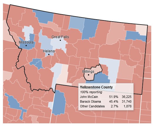
A much better county by county 2008 presidential map is found at the New York Times site:
It’s a little faint, but one nifty feature is the ability to zoom in to see data from any one county:
The NYT also has a county bubble map. Blue for Obama, and red for McCain, plus the size of the dot is proportional to the population of the county:
Lots of little red dots aren’t enough to balance out the massive blue dots of the nation’s cities.
HT: The Map Room
Grace and Peace


