A four minute video on world wealth and health that is a more interesting presentation of statistics than the norm:
The video ends on an optimistic note: everything is getting better and better, even for those down at the bottom. I would be more cautious: while life expectancy has improved for all but the poorest of the poor, there are still a billion people down at the bottom who have been left behind. And there is no guarantee that the trend will continue, as development runs into the walls of energy and water shortages, and with the ever-present risk of conflict, disease, and general human folly.
HT: Don R
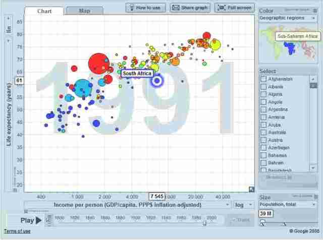
This graph, along with many others, is available in an interactive format at gapminderworld.org. For example, the GDP per capita/life expectancy graph from the 200 Countries video can be stopped or run backwards, and you can point to individual dots to see what country is represented. For example, I followed the “South Africa” dot and watched it move from 61 years life expectancy in the mid-1980s to 50 years at present (a result largely of the ongoing AIDS crisis).
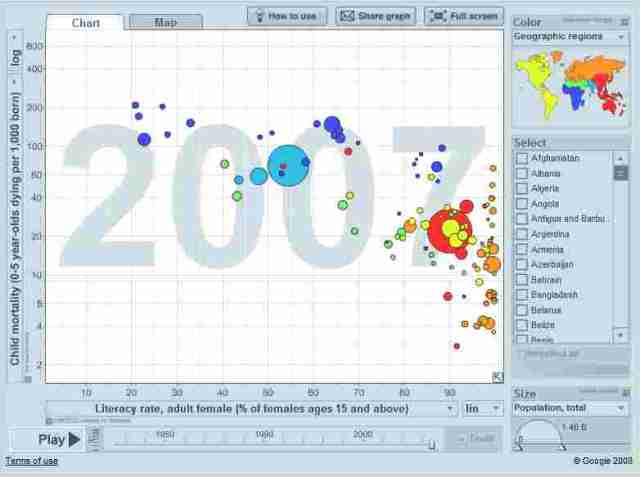
The X and Y axes of the chart can be changed to all sorts of things related to health, population, economics, education, the environment, and others. For example, here is a graph showing the relationship between adult female literacy rates and child mortality rates. The graph shows that Chad has the lowest adult female literacy rate (21%) and the highest infant mortality rate (209 child deaths per 1000 births).
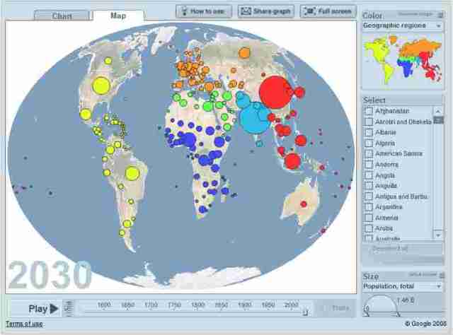
Data can also be portrayed as a map. This map can run showing population changes from 1555 to 2030:
Grace and Peace


