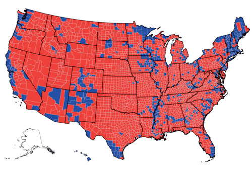
You’ve all seen the red state/blue state maps on election night. Here’s a map showing the 2008 presidential election on a county-by-county basis:
The USA looks red after all!
There is actually a lot more blue on the map than there was in 2004, when Bush defeated Kerry:
This 2004 map is asthetically much more pleasing than the 2008 map I found; I’ll keep on looking for a better 2008 map.
The 2008 map is from here. The 2004 map is from USA Today.
Grace and Peace


Comparing the two maps, one notices that the major changes seem to be in swathe of land adjacent to Canada bettwen Maine and Montana.
The largest groups of counties won by Obama seem to be in the Red River valley on the North Dakota/Minnesota border and Michigan’s Upper Peninsula. There seems to be much less gain by the Democrats further south. Why is this?
LikeLike
Since when do square miles have the right to vote?
If they don’t, as is my latest information, what possible meaning could it have that the US map looks red if stained by majorities in the counties?
Another ingenious attempt in the series of arguments according to which the US is still a centre-right country?
LikeLike
SRW1: Square miles don’t have the right to vote. But the fewer people on them, the more likely the people on them are to be Republican. This is the key insight of this map–the real split is not regional but rural-urban. The one exception is majority-black rural areas, which tend to vote Democratic.
LikeLike
How old is that hat of the rural-urban split in the US electorate?
Be that as it may, there’s another reason besides the lack of novelty why I have a little trouble to buy this innocent explanation: Click ‘Canada election map’ under the menue ‘Possibly related posts’ above and read the comment under the map of Canada that appears, especially the part in brackets.
LikeLike